After all the years of doing this, you might think it would be tough to choose a few examples of work I’m most proud of. Not really, actually. Several projects jump right to the top. Here they are, in no particular order:
KORG Logo Design
In 2011, longtime friend, Ronnie Parker, asked me to collaborate on some branding he was working on for a professional athlete who sustained a spinal cord injury leaving him paralyzed from the waist down. The athlete, Grant Korgan, has an indomitable spirit and is dedicated to sharing his experience with others. Grant’s belief that “humanity’s natural state is one of positivity, greatness, and ultimately, love,” inspired Ronnie to direct me to design the mark as a “burning heart.” Logo design always requires lots and lots of iterations. This one, however, popped out after a relatively brief bit of experimentation. It’s the best logo/mark I’ve ever done and it came out like butter, like automatic writing. Surely it was meant to be. See Grant’s story HERE.
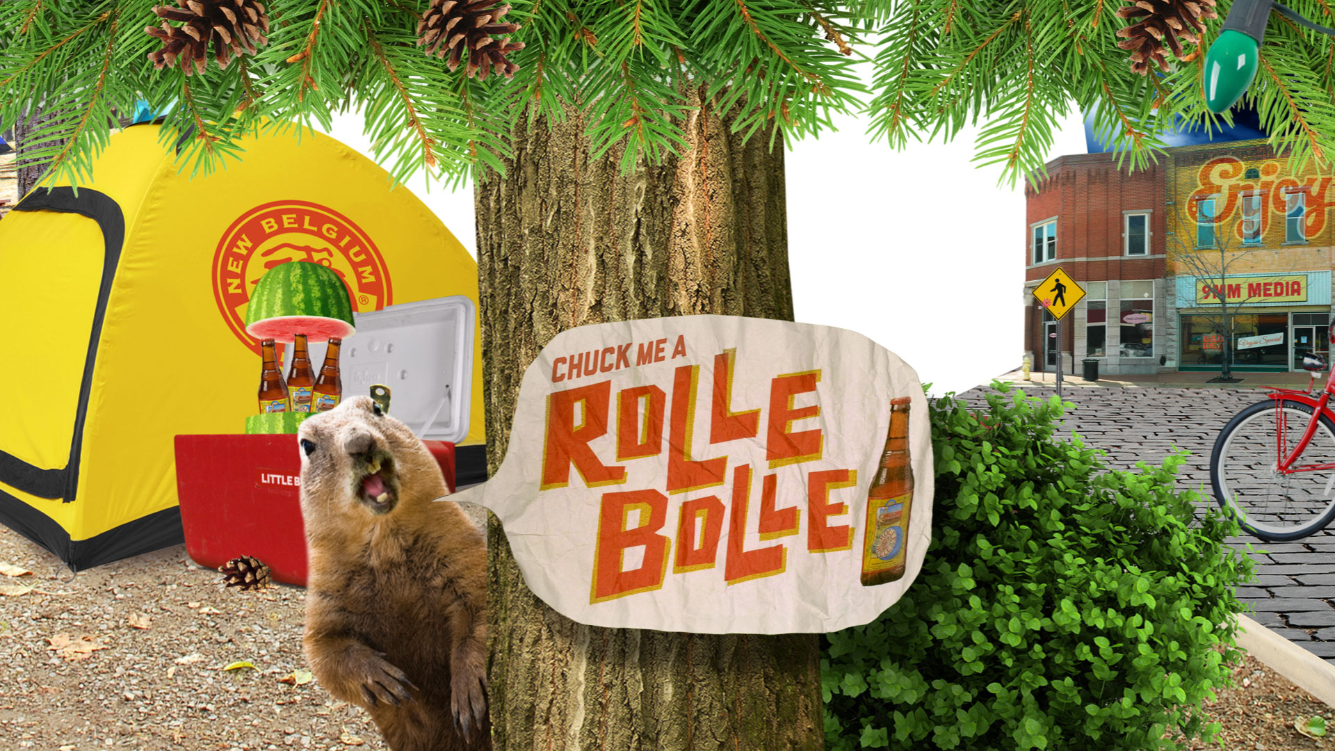
Rolle Bolle
My close friend and choice collaborator, Matt Wood, had some connections in his home state of Colorado which eventually led to our newly minted partnership, BAD IDEA MOTION STUDIOS, landing an exciting project for New Belgium Brewing, makers of Fat Tire and dozens of other great brews. I’m proud of our animation which featured the real audio voicemail of “Nivea”, an over forty Pennsylvanian cougar detailing her conquest of an innocent 21-year-old named Joshua while on a personal trip down South (see it HERE).
The client loved the animation and subsequently hired us to produce a piece for their newly released summertime seasonal ale called Rolle Bolle. We quickly worked up some concepts and got one approved. Matt knocked out some boards and I mocked them up with music and motion so the client had a good idea of where we were headed. The amount of work that we both put into this project is probably still, to this day, unmatched in man hours and I think it shows. I believe the finished piece achieves our two main objectives: make it fun and make it so it can be watched repeatedly. I’ve seen it a gazillion times and still seem to find something new. OK, that’s a lie. I’m intimately aware of every single pixel in this 82-second animation and I have the AE timelines to prove it.
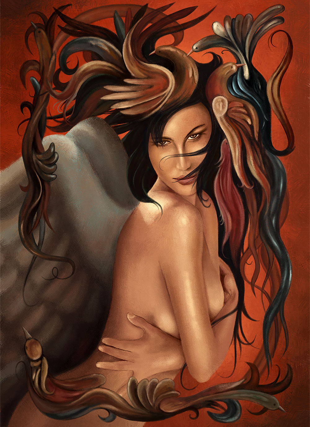
Harveys Lake Tahoe
Ronnie at Boost brought this project to me many years ago. He had a sample image of a girl adorned with feathered birds and was looking for something similar. I produced this painting digitally and it was digitally printed onto canvas at 4ft x 6ft, framed and mounted in a nightclub inside Harvey’s Lake Tahoe. The total time to produce it was about 40 hours.
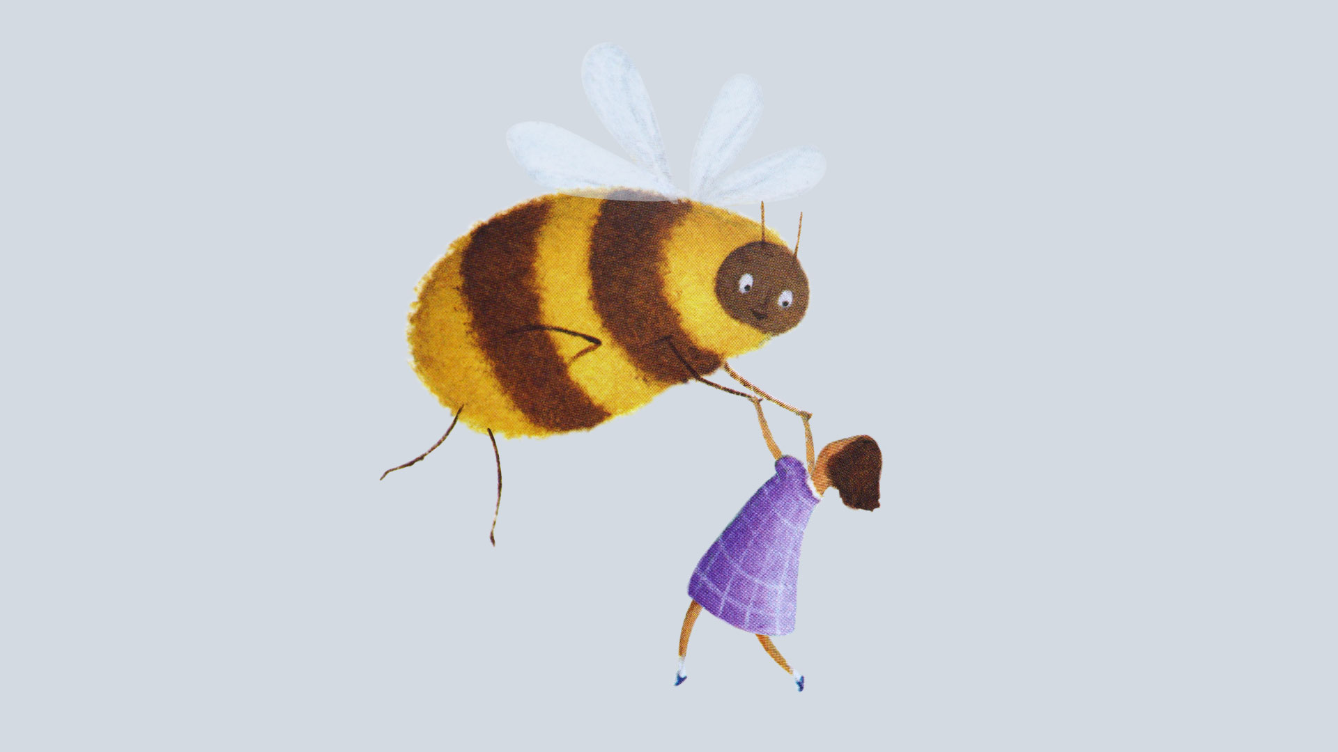
Malcolm's Garden
Although the project never came to fruition, this animated mockup is among the work I’m most proud of. For a more detailed account of the events surrounding this piece, click on “EPIC FAIL 2” in this section, or click HERE.
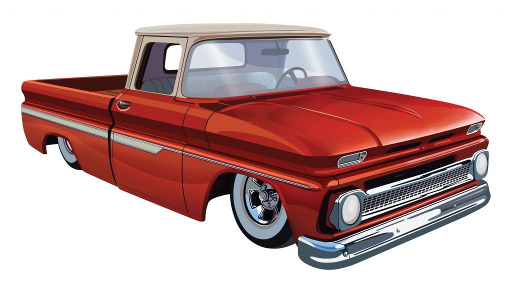
Kool April Nites
I think I can speak for the majority of illustrators when I say rendering vehicles is no walk in the park and it’s usually something I avoid like the plague. This assignment came from my friend Chad at the Antos Agency and was to be used as T-shirt art for the Kool April Nites car show in Redding, CA. While it was difficult and a huge time suck, I was happy with how it turned out. The piece is all vector art with very minimal application of the Image Trace feature. In other words, most of it was done by hand with bezier curves and blends.
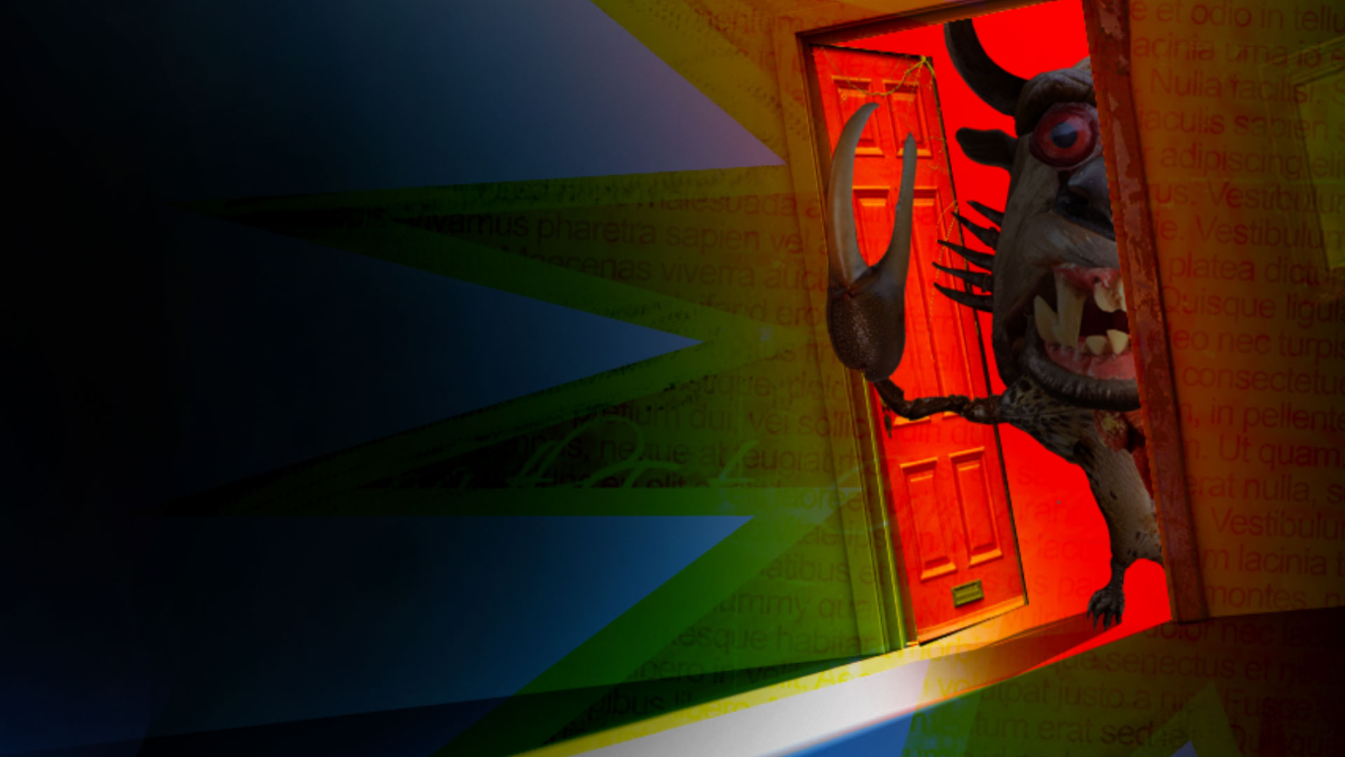
CarMD
The Phelps Group out of LA had a client, CarMD, who provided a device you could plug into your car’s diagnostic panel that would display your vehicle’s “health index.” I was asked to produce a video for an upcoming college tour that CarMD was sponsoring. They wanted it to be “wacky, edgy, viral, not corporate, and fun.” After forcefully dousing my face with a glass of ice cold water to make sure I wasn’t dreaming, I came up with the idea of a chase scene wherein the protagonist meets his monstrous demise due to his clunky cars’ inability to start. I drew up some boards, offered some styles and everything was quickly approved. This was the first time I’d ever utilized the choppy collage illustration style that has become my signature style, most recently realized in SlapJerk! Volume II.
Interesting trivia: the finished version that was delivered to the client had the eyeball bounce at the end but did not feature the bloody splat. I didn’t think Carte Blanche included graphic, bloody violence. I’d wager the college crowd would have liked it though.